NC State graduate student Josh Katz made a big splash at the New York Times in 2013 when he created a wildly popular piece of interactive content for the news organization – as an intern.
In a presentation at the D.H. Hill Library last week, Katz – now an alumnus with a full-time job at the New York Times – discussed his journey to NC State, the interactive dialect map that took the Internet by storm and the impact of data visualization as an information source for the public. The talk was part of the “Amazing Alumni” series sponsored by NCSU Libraries.
Katz’s journey to statistics started as a student, when he changed his focus from philosophy and political science.
“Philosophy is about uncovering different truths,” he said. “Statistics is about the same thing, but with data.”
Going Viral

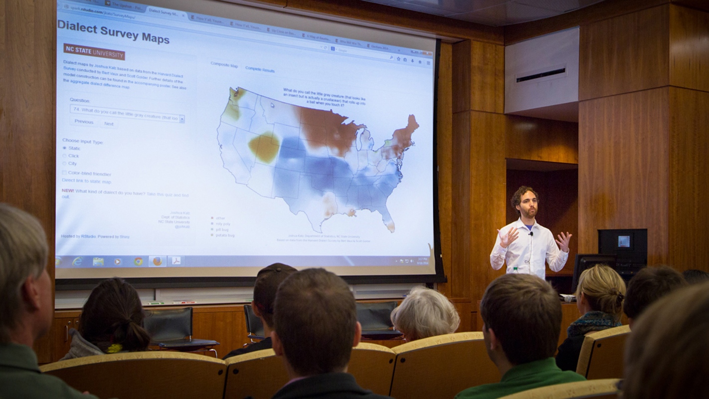
His breakout project was inspired by a Harvard Dialect Survey that documented the way people pronounce certain words in different regions of the United States. Katz layered the survey data so that audience responses ultimately pointed to places on the map where people pronounce particular words in the same way.
The result? A viral sensation that quickly became the most shared and visited piece of content published by the New York Times last year.
“It’s so surreal. [Setting the bar so high] kind of ruins everything else that I’ll work on in the future,” he joked.
Project Launches Career
Katz now works at The Upshot, a Times site that uses statistics and data visualization to tell stories.
“Data visualization is not just about pretty pictures,” he said. “It’s about understanding the data in a better way than you did before.”
Since his big break, Katz has worked on several graphics, including a map of “Baseball’s Borders” based on geographical Facebook analyses and a Senate forecasting model that simulates election outcomes with probability.
Katz believes that data visualization will grow as a source of information for the public as journalism continues to migrate to the Web.
“On the Web, we’re a bit freer,” he said. “People can dig deeper into the data and come to their own conclusions for the way things are.”
- Categories: